In this masters level course, our team focused on optimizing the Advanced Cardiovascular Life Support (ACLS) VR training debriefing sessions at the University of Michigan Medicine. The primary objective was to enhance the overall learning experience by simplifying and refining the debriefing process for both trainees and instructors. The project scope includes a user-centric design approach and a robust feedback system for continuous improvement. Through these initiatives, my team and I aimed to create a more user-friendly and efficient debriefing process and foster a positive learning environment.
Year
Aug '23 - Dec '23
Project
SI 582: Introduction to Interaction Design
Tools
Figma, FigJam
Roles & Responsibilities
User research
Research synthesis
Ideation sketches
Design development
User flows
Wireframing & Prototyping
Usability Testing
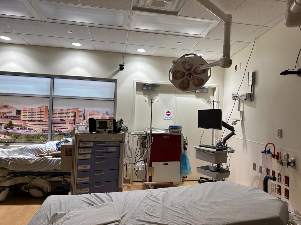
The Client
Michigan Medicine
The Solution
Interview Findings

“It is important to tailor the feedback system to our specific learner population and personas. “
- Instructor

“Sometimes it’s almost too much training and there tends to be more questions than there is time to ask them. “
- Student

“Timeframes are frequently referenced, underpinning the narrative's context. “
- Student
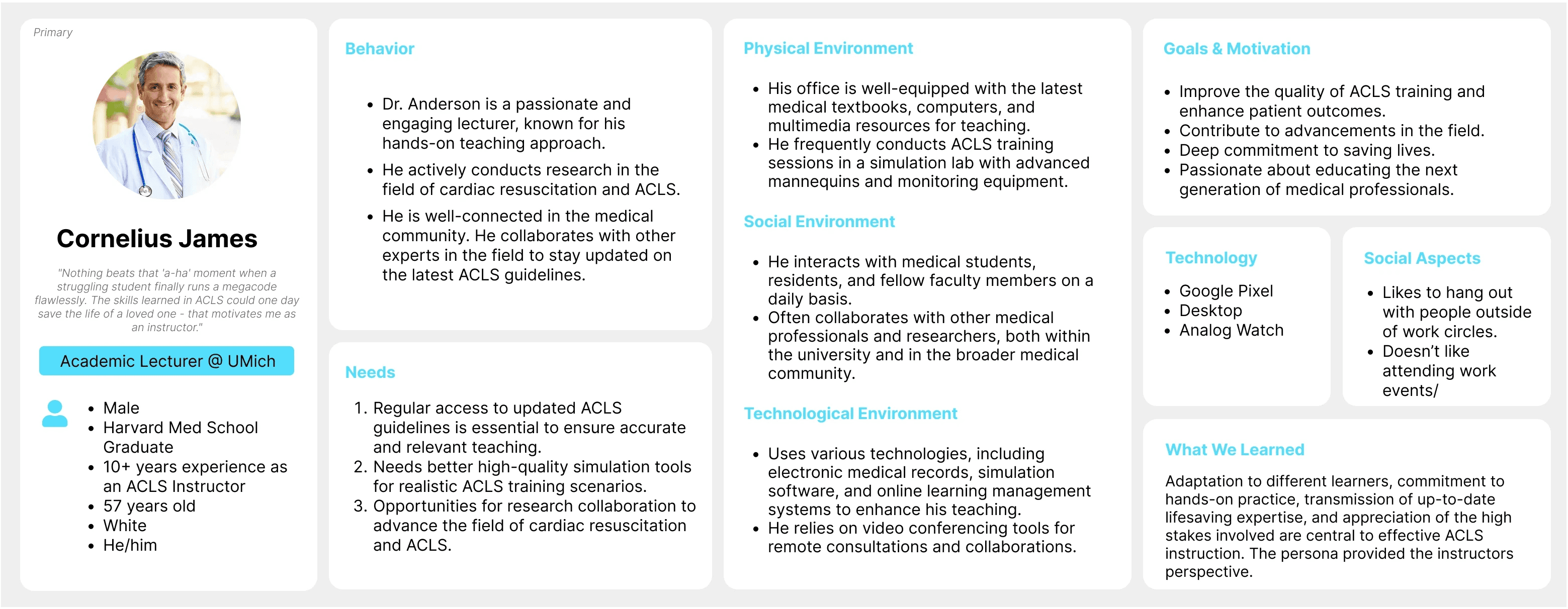
Personas


QOC(Questions, Options, Criteria)
Experience Journey Map & Story Map
Experience Journey Map

Story Map
The blue dotted lines around the sticky notes highlight the instructor's actions.
User Flow Diagram

Low-fidelity Prototype


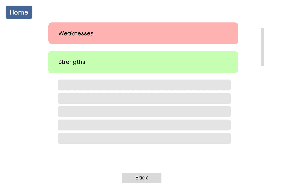


Mid-fidelity Prototype
After conducting usability tests with instructors and trainees at the University of Michigan hospital, we gained key insights which ultimately helped us refine our design and remove any irrelevant details.
Use the slider to compare the low-fidelity and mid-fidelity designs.


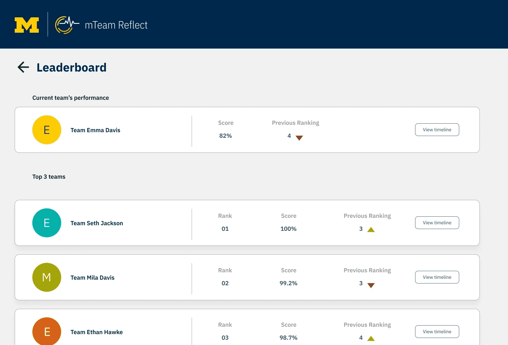

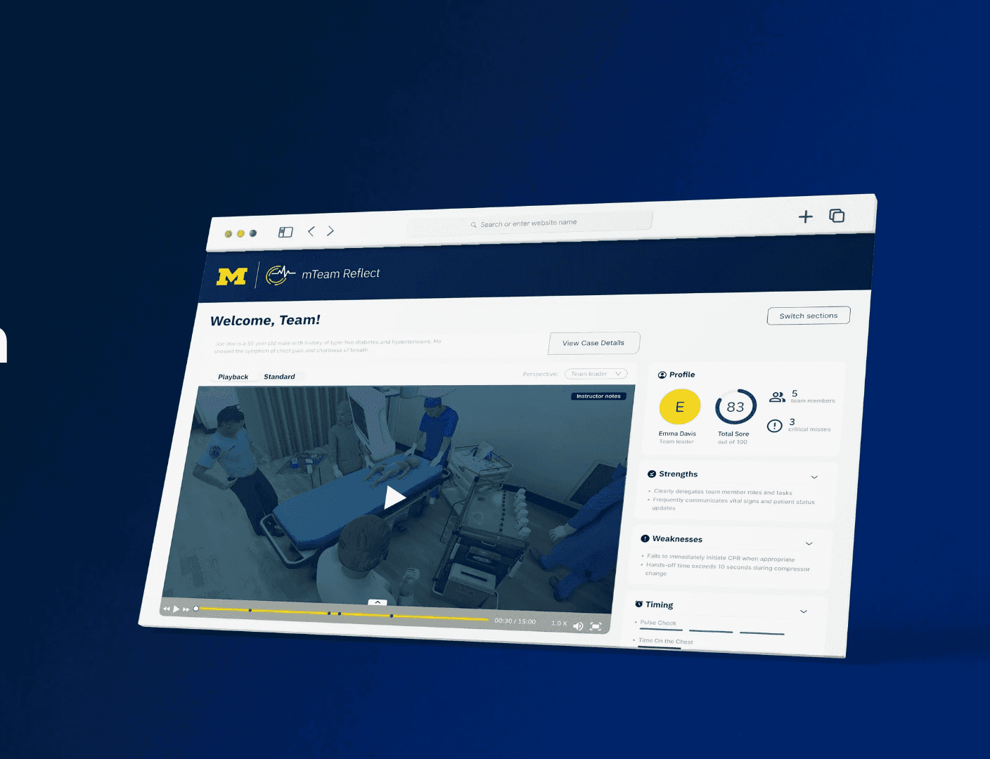
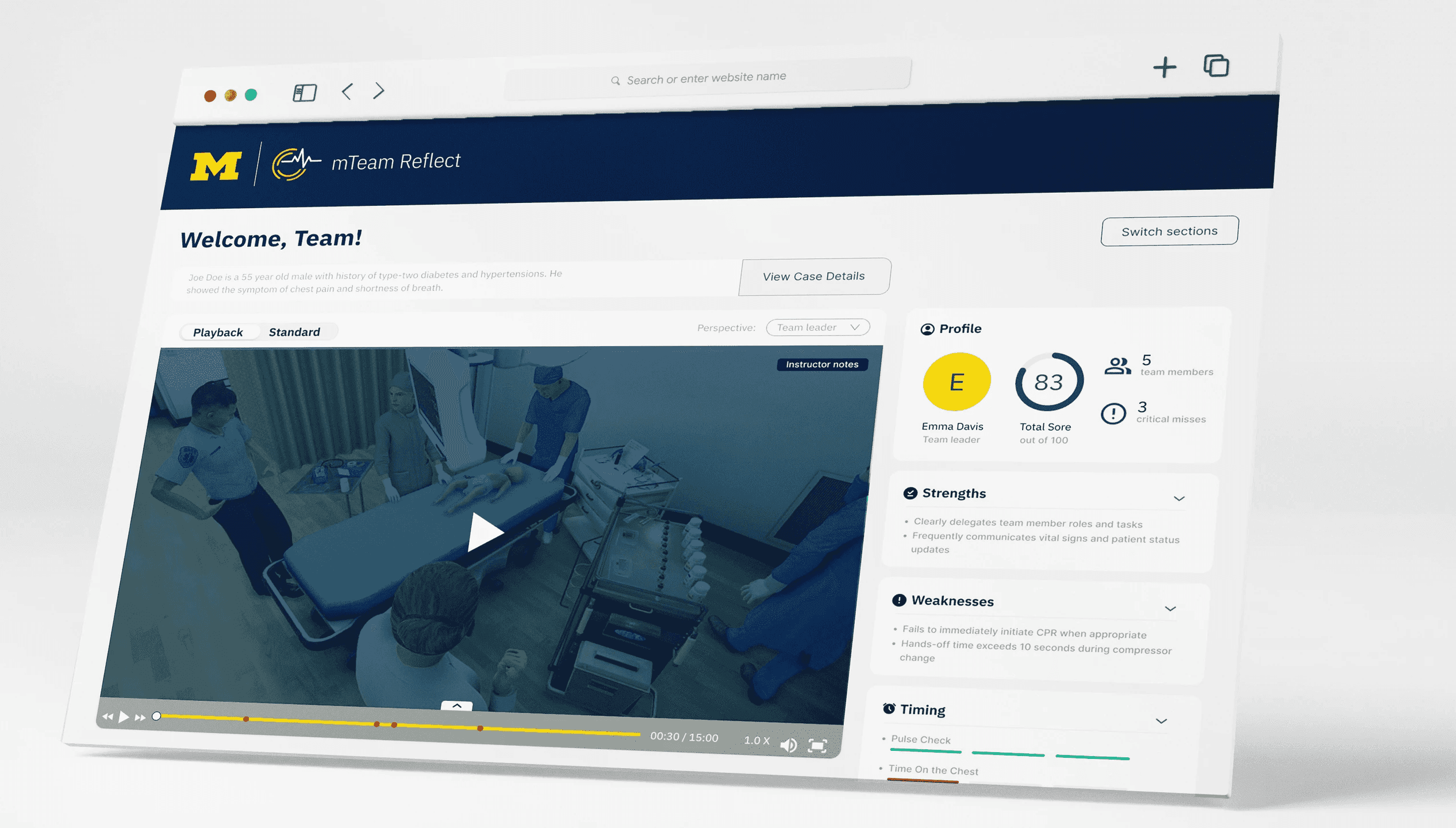
Summary Dashboard
As instructors have multiple teams, this dashboard allows them to dive into team - specific data with more gradual detail
Prototype Walkthrough
This video highlights the walkthrough through of all three stages of our product.
Branding
For the branding, we followed all guidelines of Michigan Medicine to ensure it follows their identity and blends in with their aesthetic.

IBM Plex Sans
ABCDEFGHIJKLMNOPQRSTUVWXYZ
012345
00274C
576E9A
DAEDFA
FFCB05
E9E9E9
989C97
Learning Outcomes
I acquired substantial expertise in information gathering through user interviews with instructors and medical trainees, aiming to comprehend their experiences and pain points within the current system. Employing this qualitative data, we crafted primary and secondary personas to cater to distinct user profiles.
I gained exposure and confidence in UI/UX methodologies, including QOCs (Questions, Options, Criteria), storyboarding, journey mapping, and story mapping. My team and I synthesized these insights into a comprehensive user flow diagram, serving as a foundational guide for developing the prototype screens.